
- Published on
Execvision Charts
ev-charts
2021 UPDATE - This is old and based on React 15. Don't judge me for any class components and lack of hooks :)
ev-charts is an npm library I built for ExecVision to house all our d3 react components. We primarily use d3 as a library and build <svg/> elements declaratively in typescript-aware react components. Here are a few fun examples -
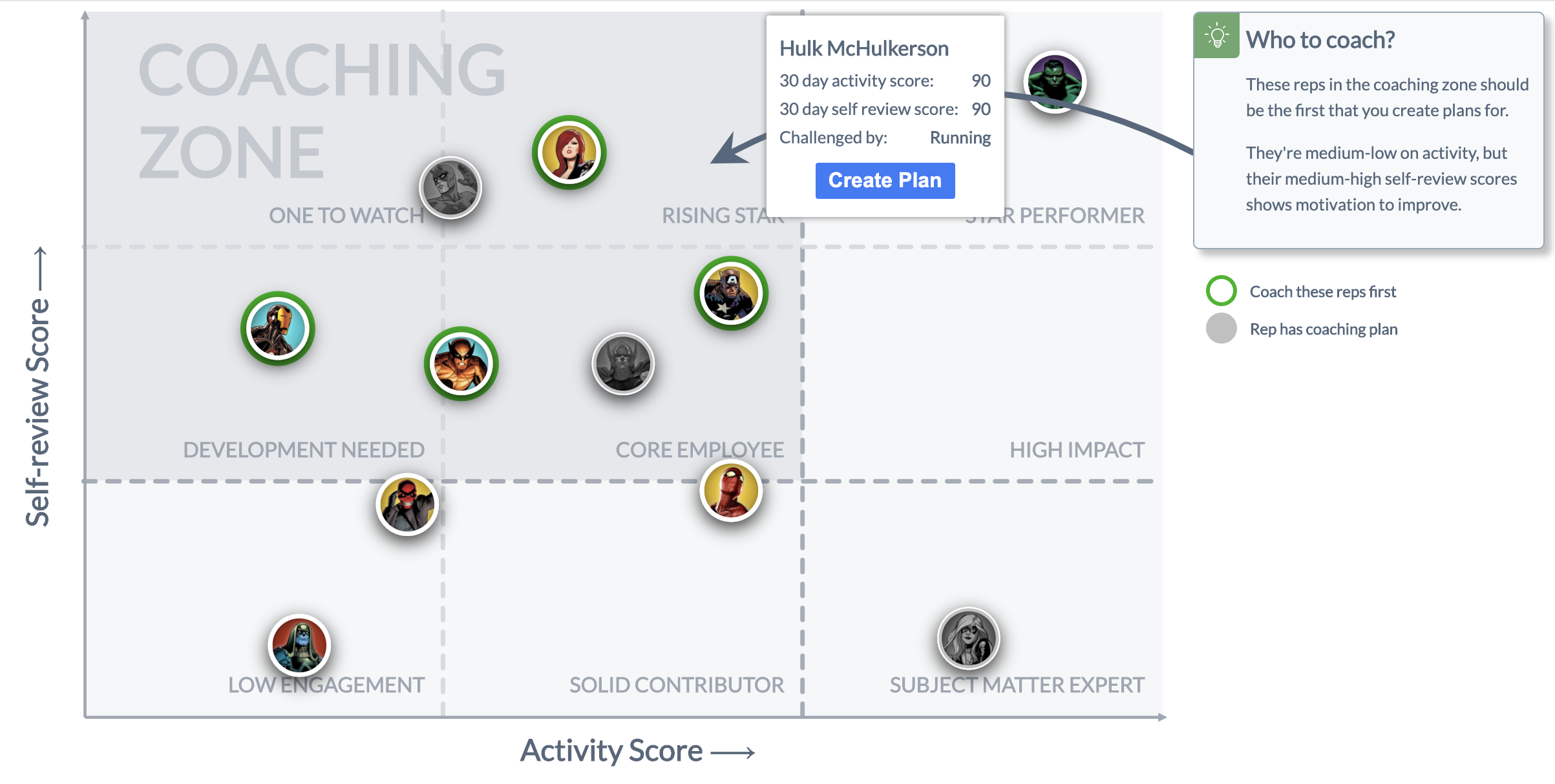
9 box
The 9 box chart is meant to answer the fundamental question - "Who should I coach?" Managers only have so much time in the day, and you want to focus your attention on employees that
- Have room to improve
- Show willness (through self review)
Since we can ascertain these two metrics through usage in the app, we plot them as the x and y on a scatter plot (this is all based on an HR talent philosophy)
Here is a happy example of the resulting output. Note that the suggestion would get dynamically rendered based on where the teams fell in the plot.
The following snippet is the high level AvatarScatterPlot render() method. I like how clean it turned out:
<FlexWrapper>
  <Chart bordered={false} margins={margins} svgDimensions={svgDimensions}>
    <PerformanceQuadrants scales={scales} margins={margins} />

    <CleanArrowLeftAxis
      scales={scales}
      margins={margins}
      svgDimensions={svgDimensions}
      label={`Self-review Score ⟶`}
    />
    <CleanArrowBottomAxis
      scales={scales}
      margins={margins}
      svgDimensions={svgDimensions}
      label={'Activity Score ⟶'}
    />

    {reps.map(({ rep, coordinate, additionalInfo }, i) => (
      <FancyAvatarPoint
        key={i}
        scales={scales}
        coordinate={coordinate}
        highlight={shouldHighlight(coordinate)}
        rep={rep}
        additionalInfo={additionalInfo}
        defaultAvatar={defaultAvatar}
      />
    ))}
    {repsWithoutPlans.length !== 0 && arrowPointer && arrowDelta && (
      <CalloutArrow
        from={arrowPointer}
        to={{ x: svgDimensions.width, y: scales.yScale(80) }}
        delta={arrowDelta}
      />
    )}
  </Chart>
  <AdditionalInfo>
    <CalloutCard title="Who to coach?" extra={this.getExtraTooltipInfo(repsWithoutPlans)} />
    <AvatarScatterPlotLegend />
  </AdditionalInfo>
</FlexWrapper>
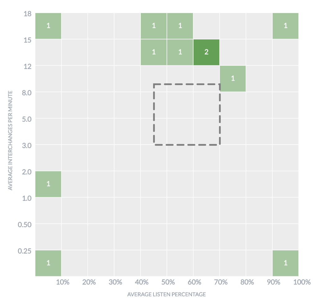
Exec talk/listen heatmap
This is a heatmap that rolls up the organization into certain quadrants based on a couple of call metric ratios - their talk/listen ratio on a call vs interchanges. We think there is an optimal amount of both, so we made a little callout area in the heatmap.
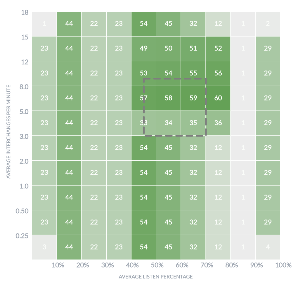
Here are a few relatively boring storybook examples:
One interesting piece of the build out of this component - I built a typescript HoC that could accept a list of user metrics of this shape:
export interface UserTalkListen {
  user: User
  talkListen: number
  interchanges: number
}
and bridge the gap to the "pure" heatmap component that rendered "buckets"/cells:
export interface HeatmapProps {
  data: number[][]
  bucketBounds: BucketBounds
  bucketCallout?: BucketCallout
  onClickCell: (c: Cell) => void
  onDoubleClickCell?: (c: Cell) => void
}
It was initially meant to provide zoom functionality as well but was later scrapped. The HoC typing looked like this, just to give you an idea
interface Zoomable {
  onZoomIn: (c: Cell) => void
  onZoomOut: () => void
  onZoomReset: () => void
}

export interface WithBucketingProps extends Zoomable {
  reps: UserTalkListen[]
  bucketBounds: BucketBounds
  bucketCallout?: BucketCallout
  onSelectReps: (users: User[]) => void
}

export interface WithBuckets {
  data: number[][]
  onClickCell: (c: Cell) => void
  onDoubleClickCell?: (c: Cell) => void
}

export interface ZoomLevel {
  // yes i know the 3d array looks crazy, but 2d was to render the x&y, and the
  // 3rd was to store the underlying reps to display next to the graph on click!
  // note this was collapsed to 2d when passing down so the underyling component
  // didnt have to care
  buckets: UserTalkListen[][][]
  bucketBounds: BucketBounds
}

/**
 * HoC that wraps the heatmap and provides "pure" and simple data to it,
 * keeping track of the bucketed data it was given.
 *
 * Later provide zoom through this guy too (since this has bucketbounds and reps)
 *
 * @param Component - a (presumably heatmapish) component that supports getting a 2d array of data
 */
export const withBucketing = <P extends WithBucketingProps, U extends WithBuckets>(
  Component: React.ComponentType<U>
) => {
  return class WithBucketing extends React.Component<P & U, { zoomLevels: Stack<ZoomLevel> }> {
    constructor(props: P & U) {
      super(props)

      this.state = {
        zoomLevels: new Stack<ZoomLevel>(),
      }
    }

    // ... this component would bucket / transform and pass off to the wrapped component
  }
}
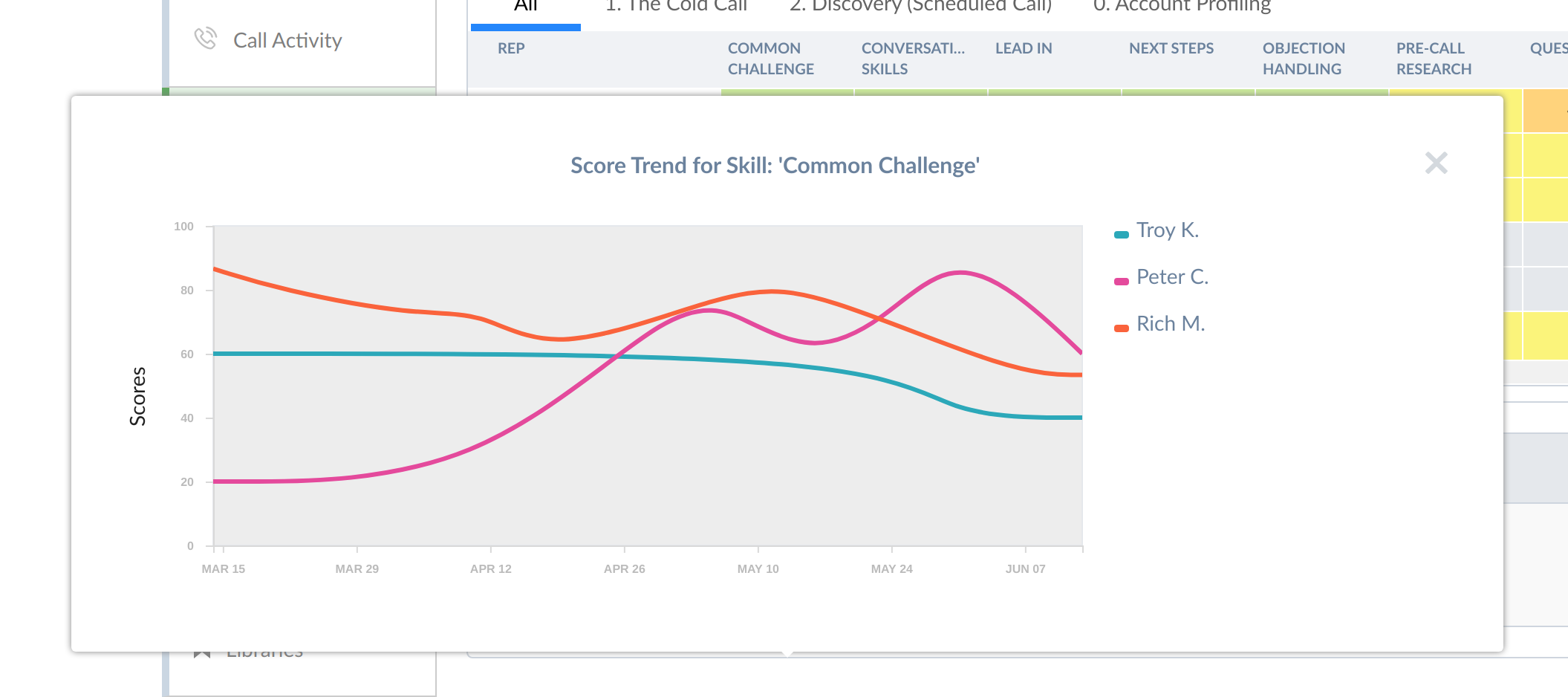
Trend sparklines
Everybody loves their sparklines, especially when they go up and to the right. We revamped ours a few times and eventually settled on a scatterplot looking chart, drawing a curved "fit" line to help the user make sense of the trend.
When looking at one trend in particular, we'd show the underlying data.
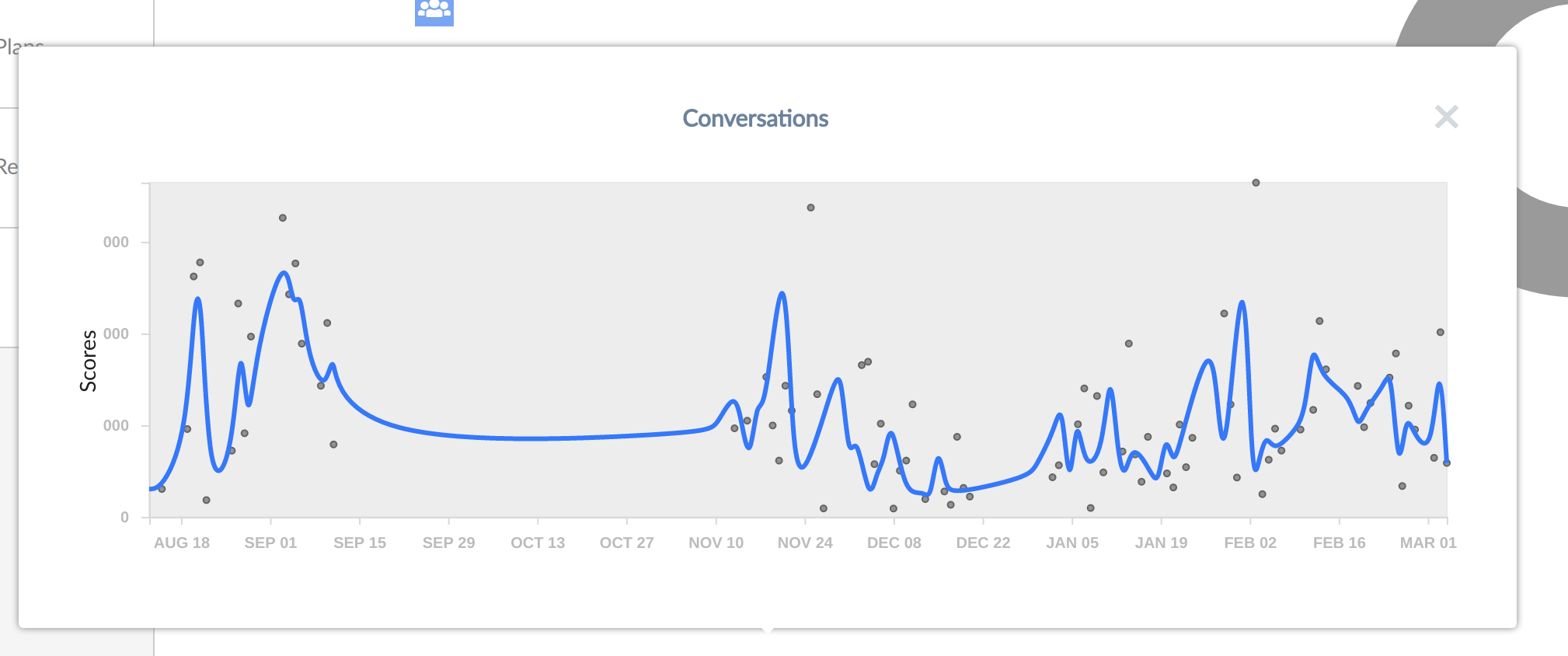
If we showed multiple for you to compare, we'd hide the underlying data until you hovered/pinned on the trend.
No sparkline is complete without fancy animations -
Coaching Effectiveness
So the manager spent time coaching, but was it effective? We try to present this metric visually - if the amount of time the manager spends coaching moves the needle on rep call quality or not.

Progress circle
Nothing fancy, just a nice little animated progress circle that does what you want. Check it out in the previous combo chart.